Event campaigns are tricky. You have to create a message that resonates with the audience and a look and feel that is vibrant and fresh, all while maintaining the essence of the brand. How do you entice potential attendees, especially those who come every year? Focus on the overall experience and make sure everything connects.
CASE STUDY
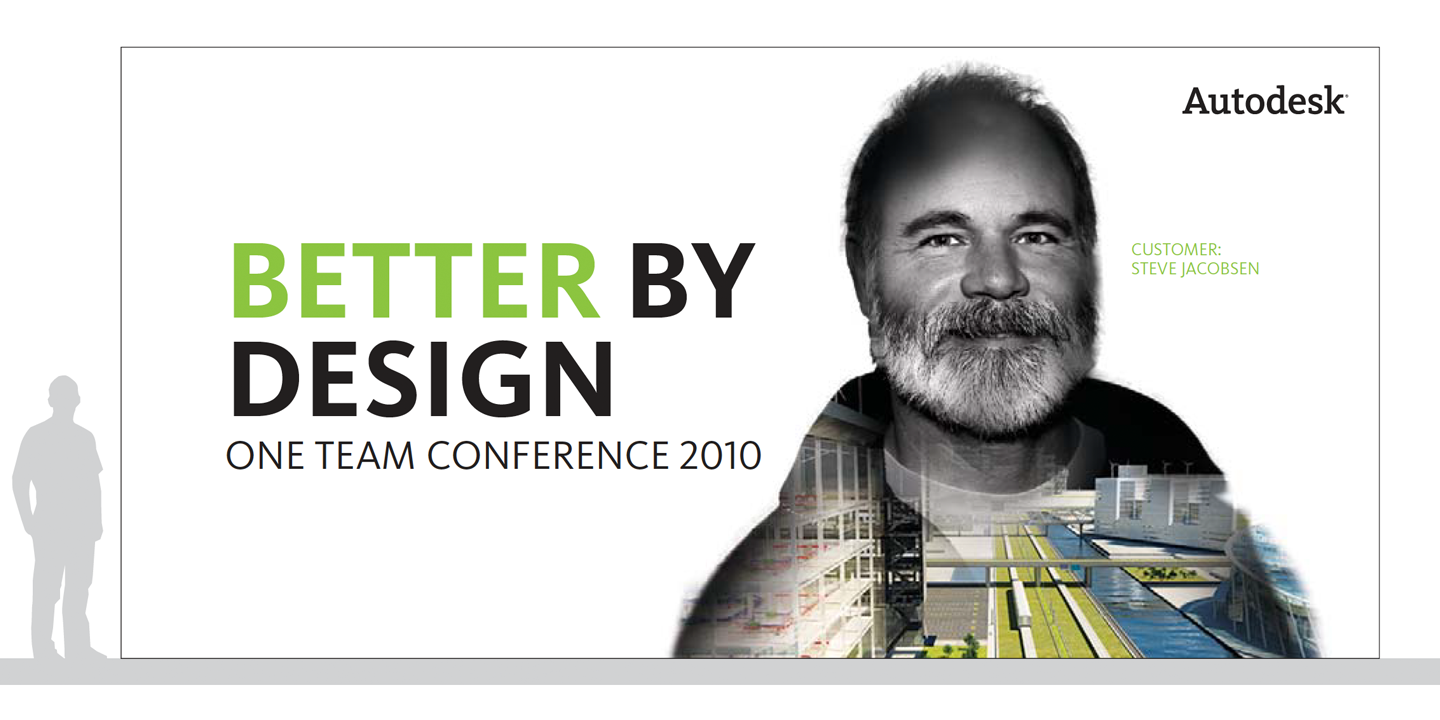
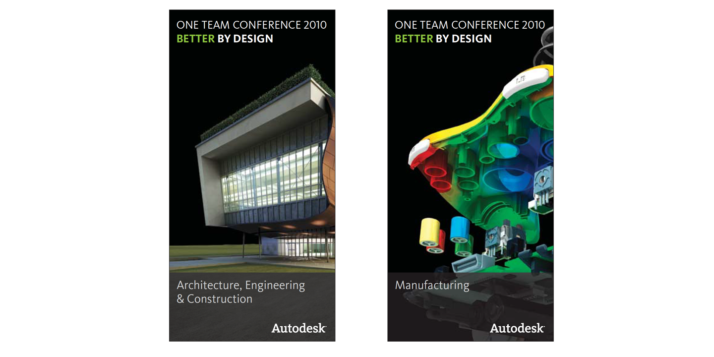
Autodesk One Team Conference
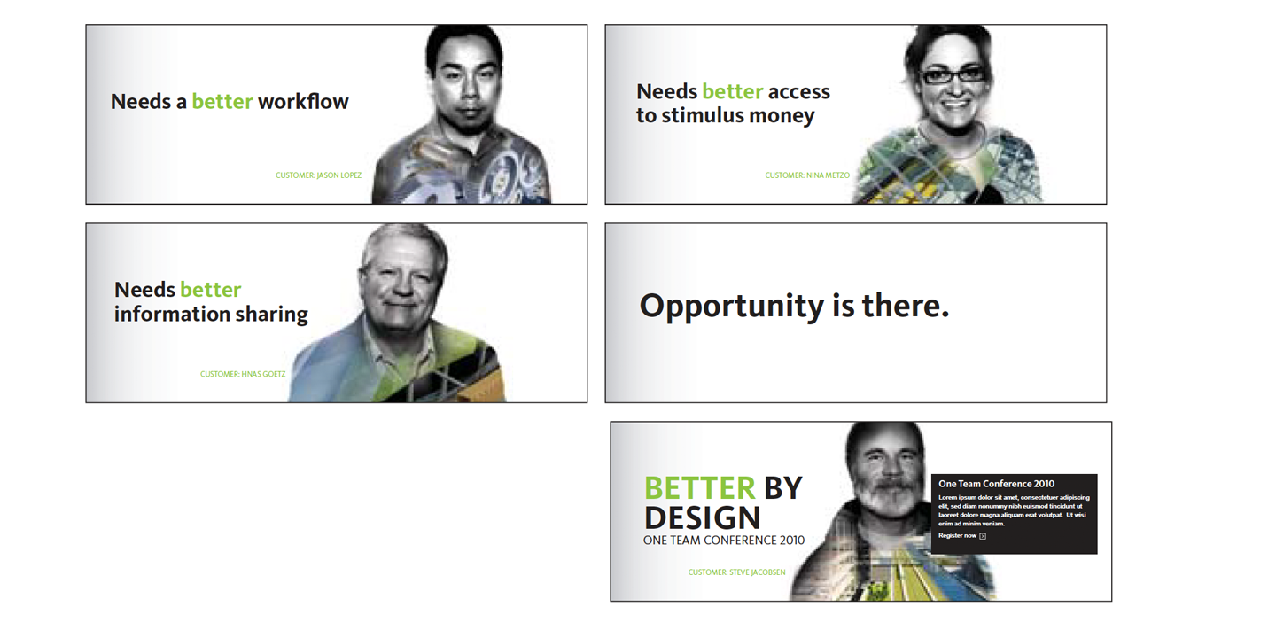
Here is one example from sixteen different identities I developed while at Autodesk. The target audience was sales people; the enticement – focus on your customer because Autodesk products are better for both the act of designing and the business of design.

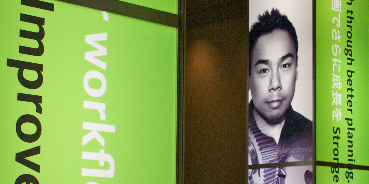
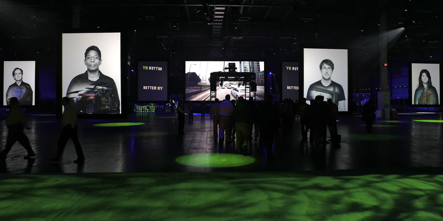
In order to illustrate the necessity of customer focus, we featured images of real customers with digital representations of their real projects superimposed on their bodies. Because of Autodesk products, these customers are better designers compared to their own competition.
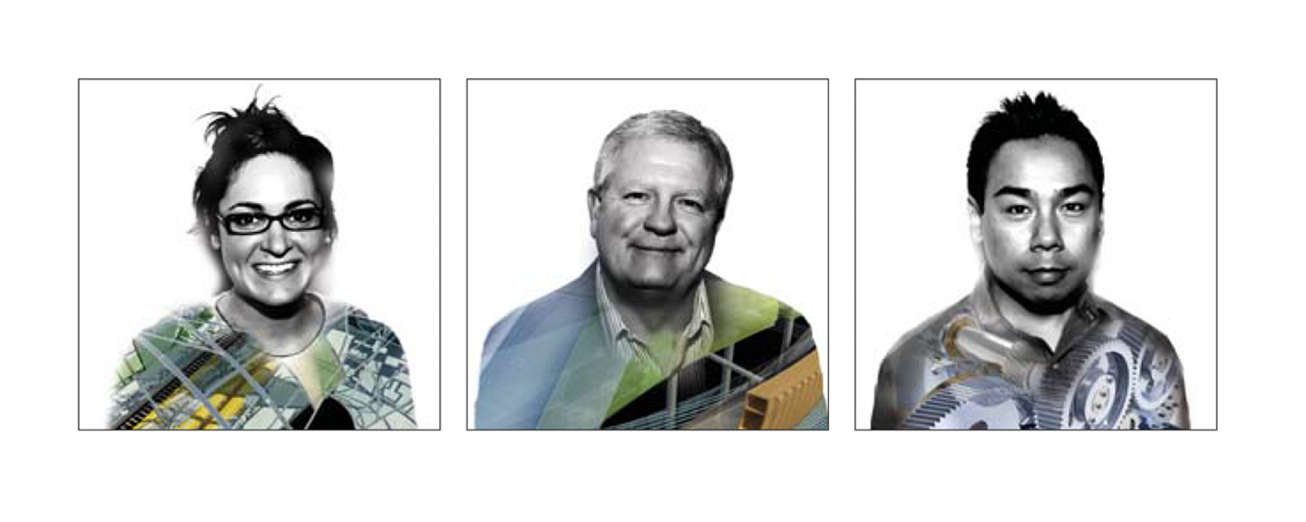
Image system
Plan for homepage animation.

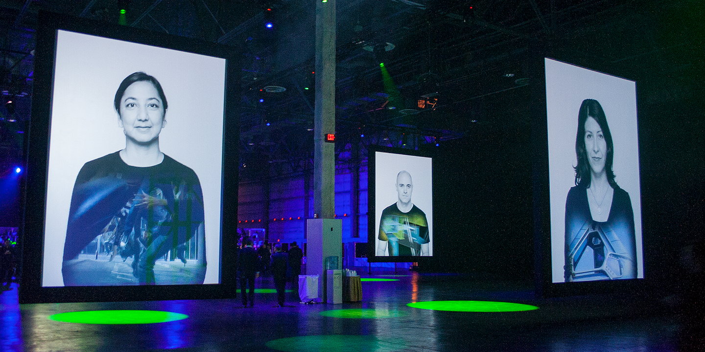
Mainstage
As creative director and art director at Autodesk, I drove the practice of event design and campaigns at the company. Together with a small team, I proposed event themes and developed the overall look and feel for all major events. These identities need to work across platforms – from web, to print, to environment, to video and staging. I lead the design an implementation of visual identities for ten user conferences (Autodesk University with more that 10,000 attendees) and six sales conferences (One Team Conference, with over 3,200 attendees).
Creative Direction / Art Direction: Andrew Loesel // Art Direction / Design: Alain Bolduc // Staging: Tencue Productions