The founders of West+Wilder had an entirely new concept in winemaking:
A high-quality, non-varietal wine made from West Coast grapes and conveniently delivered. They needed a brand image that could not only convert consumers’ traditional
notions of what great wine looked like but also appeal to a millennial audience.
A high-quality, non-varietal wine made from West Coast grapes and conveniently delivered. They needed a brand image that could not only convert consumers’ traditional
notions of what great wine looked like but also appeal to a millennial audience.
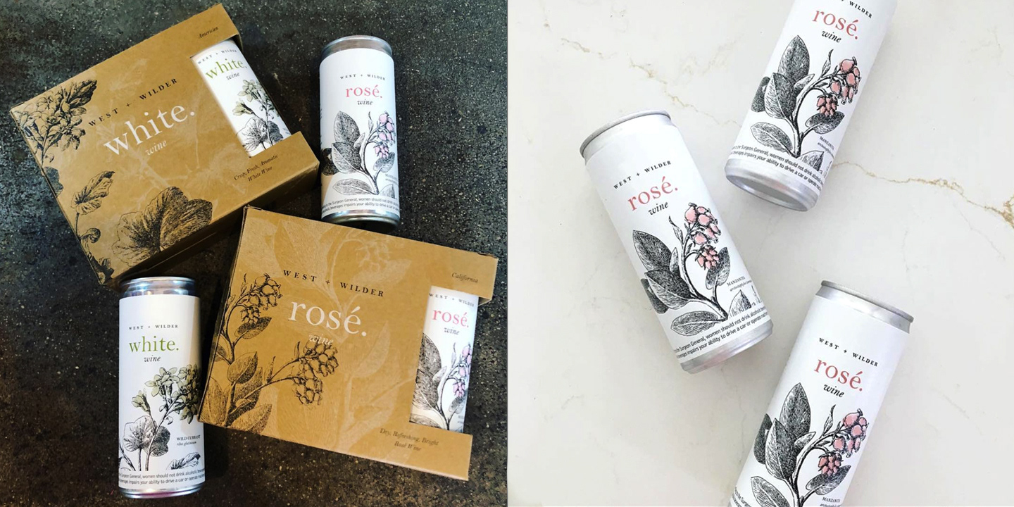
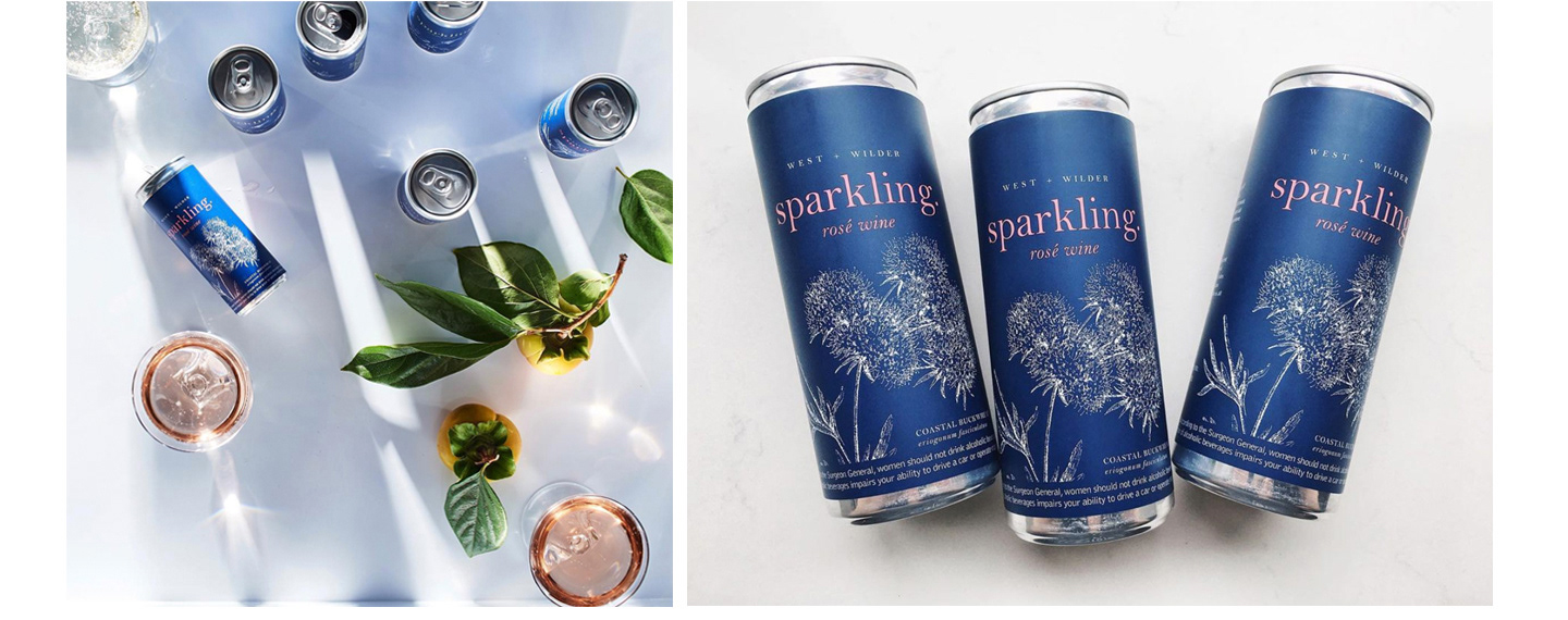
The beauty and wildness of the West became an inspiration for the look and feel of
the overall brand. As the most important touchpoint, the packaging features simple black
and white illustrations and typography on small cans and fiberboard to deliver on the with the core brand values: quality, convenience, and responsibility.
the overall brand. As the most important touchpoint, the packaging features simple black
and white illustrations and typography on small cans and fiberboard to deliver on the with the core brand values: quality, convenience, and responsibility.
Creative Direction: Andrew Loesel // Design: Andrew Loesel // Founders: Matthew Allan, Kenneth Rochford
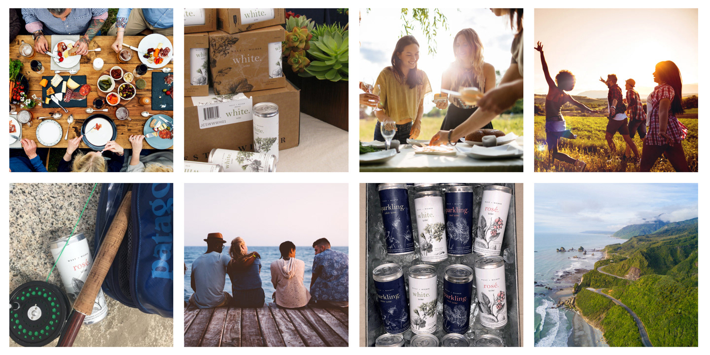
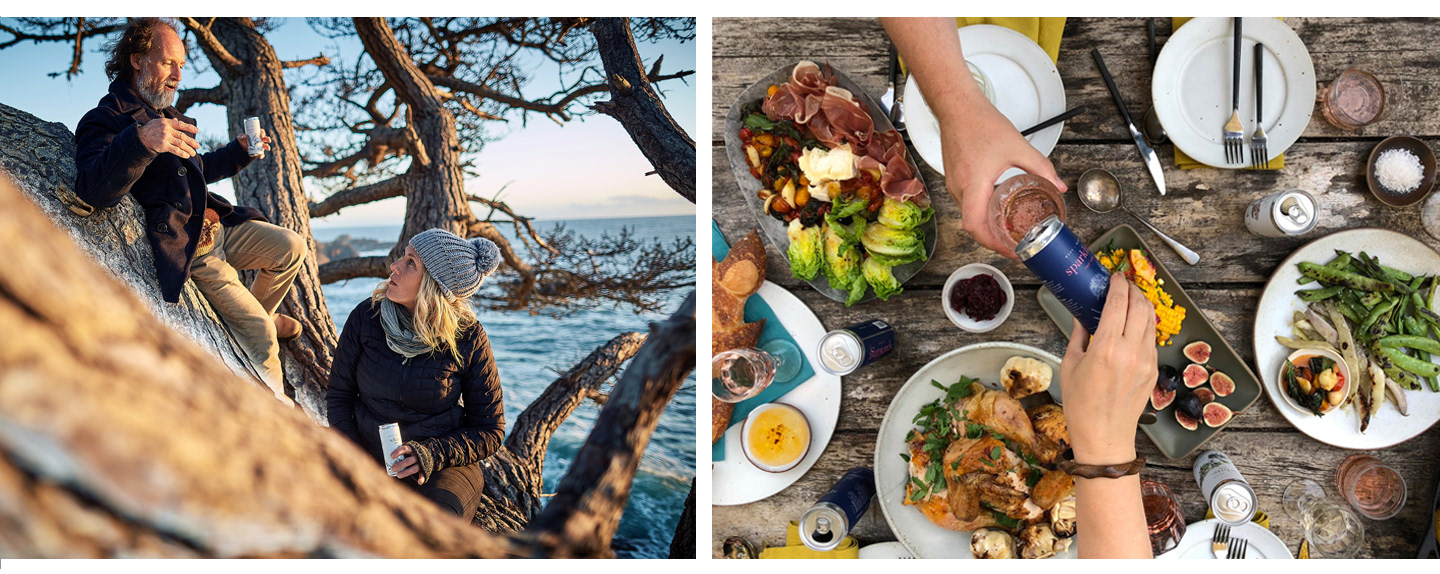
For image strategy, we wanted to capture a sense of celebration, a lightness,
a joyfulness; something that would appeal to dreamers, seekers, thinkers—those who appreciate the good things in life with care, humor, mindfulness and beauty.
a joyfulness; something that would appeal to dreamers, seekers, thinkers—those who appreciate the good things in life with care, humor, mindfulness and beauty.
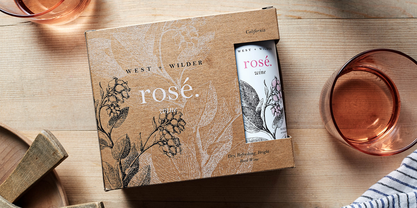
We tested six different label designs to discover that these simple
botanical illustrations of West Coast plants held considerable power with
the audience. The illustrations, hand tinted, come from a book called
The Wild Flowers of California: Their Names, Haunts, and Habits (1897)
written by Mary Elizabeth Parsons with drawings
by Margaret Warriner Buck.
botanical illustrations of West Coast plants held considerable power with
the audience. The illustrations, hand tinted, come from a book called
The Wild Flowers of California: Their Names, Haunts, and Habits (1897)
written by Mary Elizabeth Parsons with drawings
by Margaret Warriner Buck.
For the 1906 edition of the book, new printing plates had to be made because the existing
set had been destroyed in the San Francisco earthquake.
set had been destroyed in the San Francisco earthquake.
The brand has sold very well with the initial target audience,
and distribution has expanding across the nation, delivering on the brand promise:
“A great bottle of wine that just happens to come in cans.”
and distribution has expanding across the nation, delivering on the brand promise:
“A great bottle of wine that just happens to come in cans.”
Deliverables have included wine label designs for six wines, three-can boxes, cartons, case cards,
logo, imagery, website, advertisements, print collateral, sales sheets, truck wrap
logo, imagery, website, advertisements, print collateral, sales sheets, truck wrap