How do you transform a company with one product and led by engineers into a global brand known for groundbreaking technology that appeals directly to homeowners? Reposition the company as the simple, smart, approachable brand you can trust in the solar space.

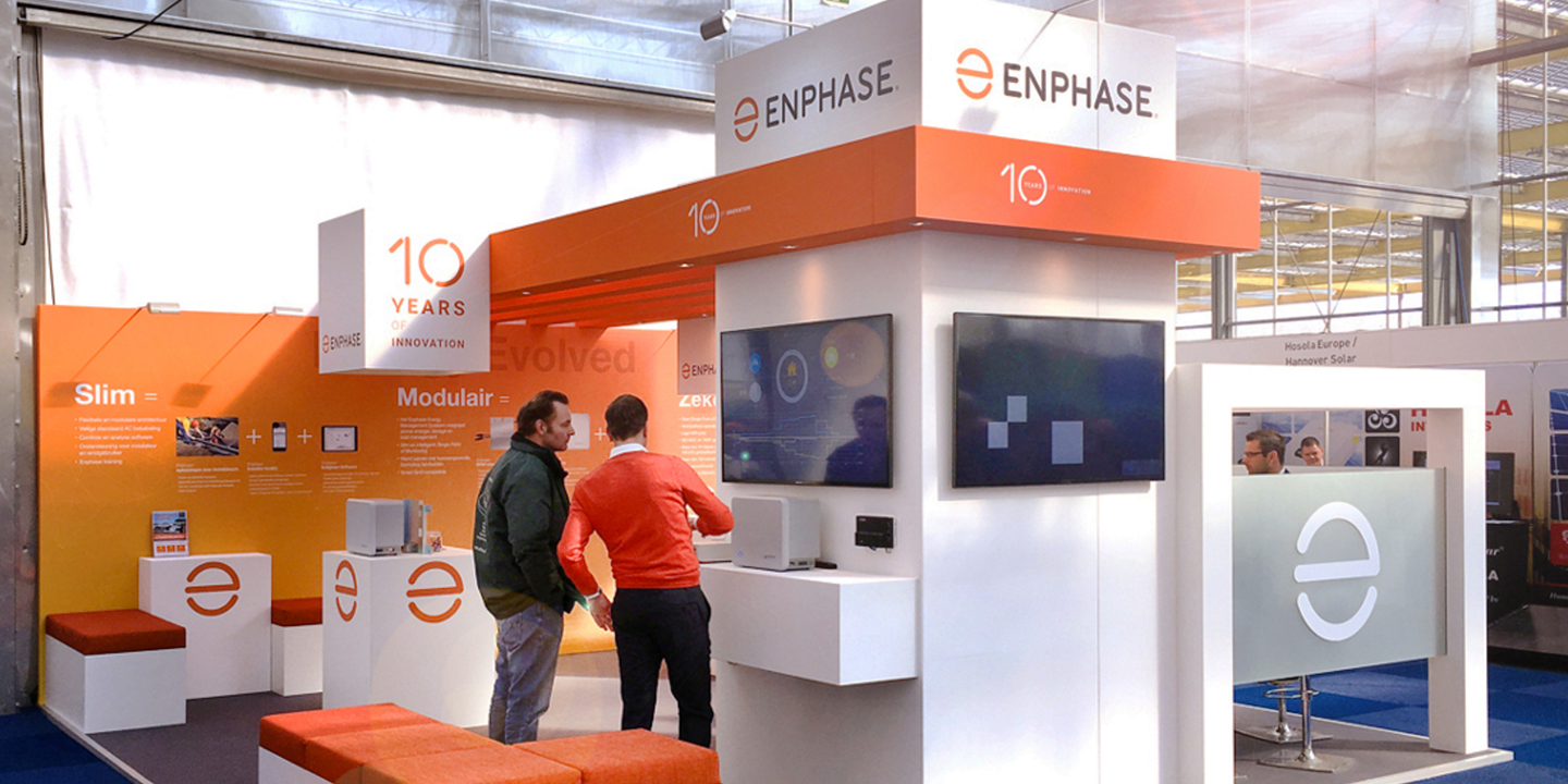
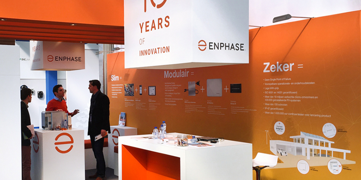
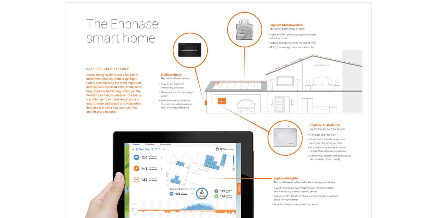
By concentrating our efforts on three core attributes—simple, smart, approachable—we refreshed the voice and look of Enphase Energy. Using conversational language, a focus on imagery of people and families, and simple, easy-to-understand graphics, we transformed what had been an industrial, technical brand into a welcoming place for homeowners and installers alike.
Convincing company founders and the CEO of the need for a new logo was no small task, but once they saw the simplicity and appeal of the new mark, they became advocates. This new Enphase logo took inspiration from many places – the power-on symbol, the architect’s symbol for electrical outlet, the happy face. The symbol, combined with a hand-drawn, rounded logotype, makes for a more friendly and approachable company.
Design: Andrew Loesel
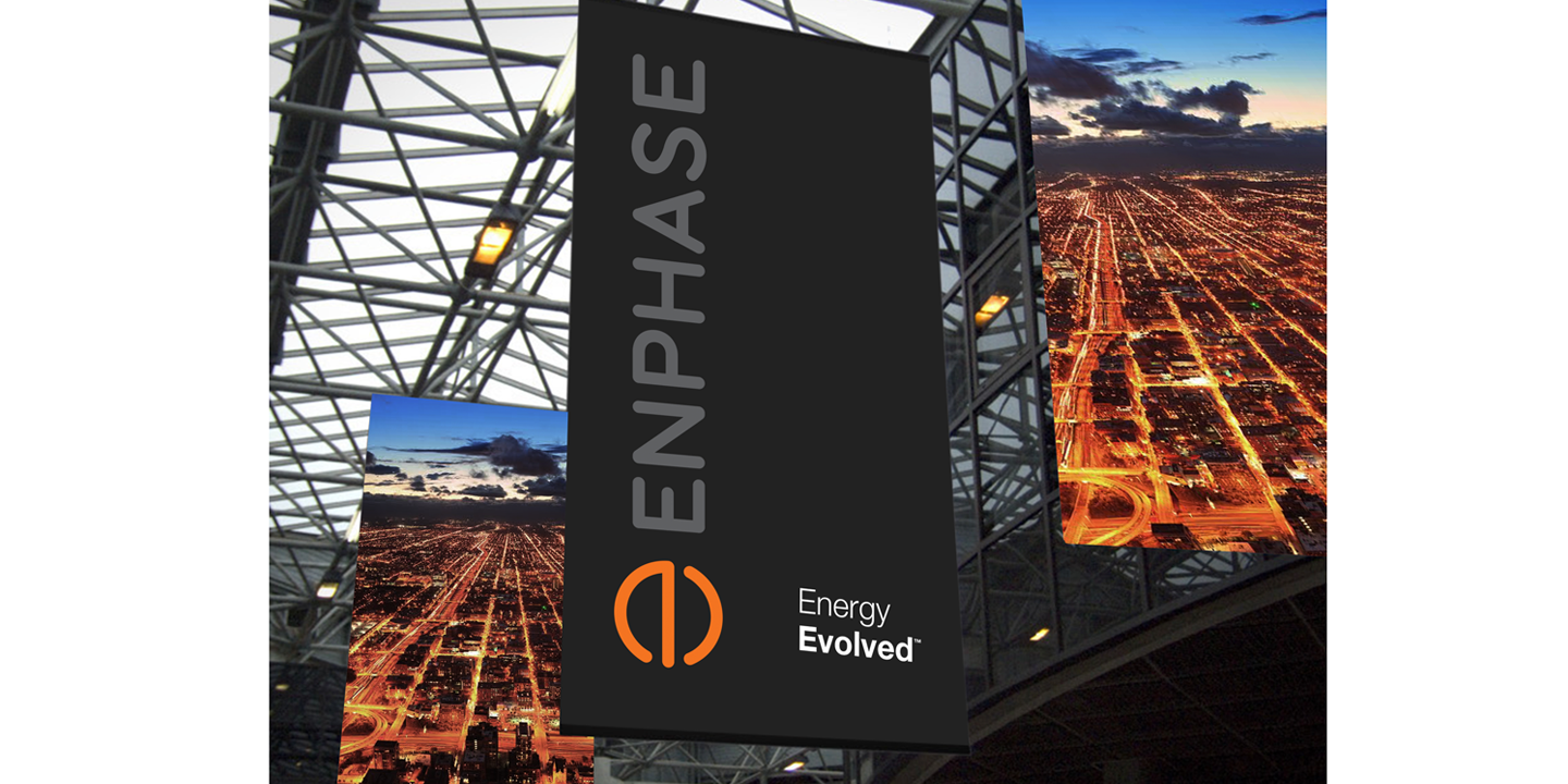
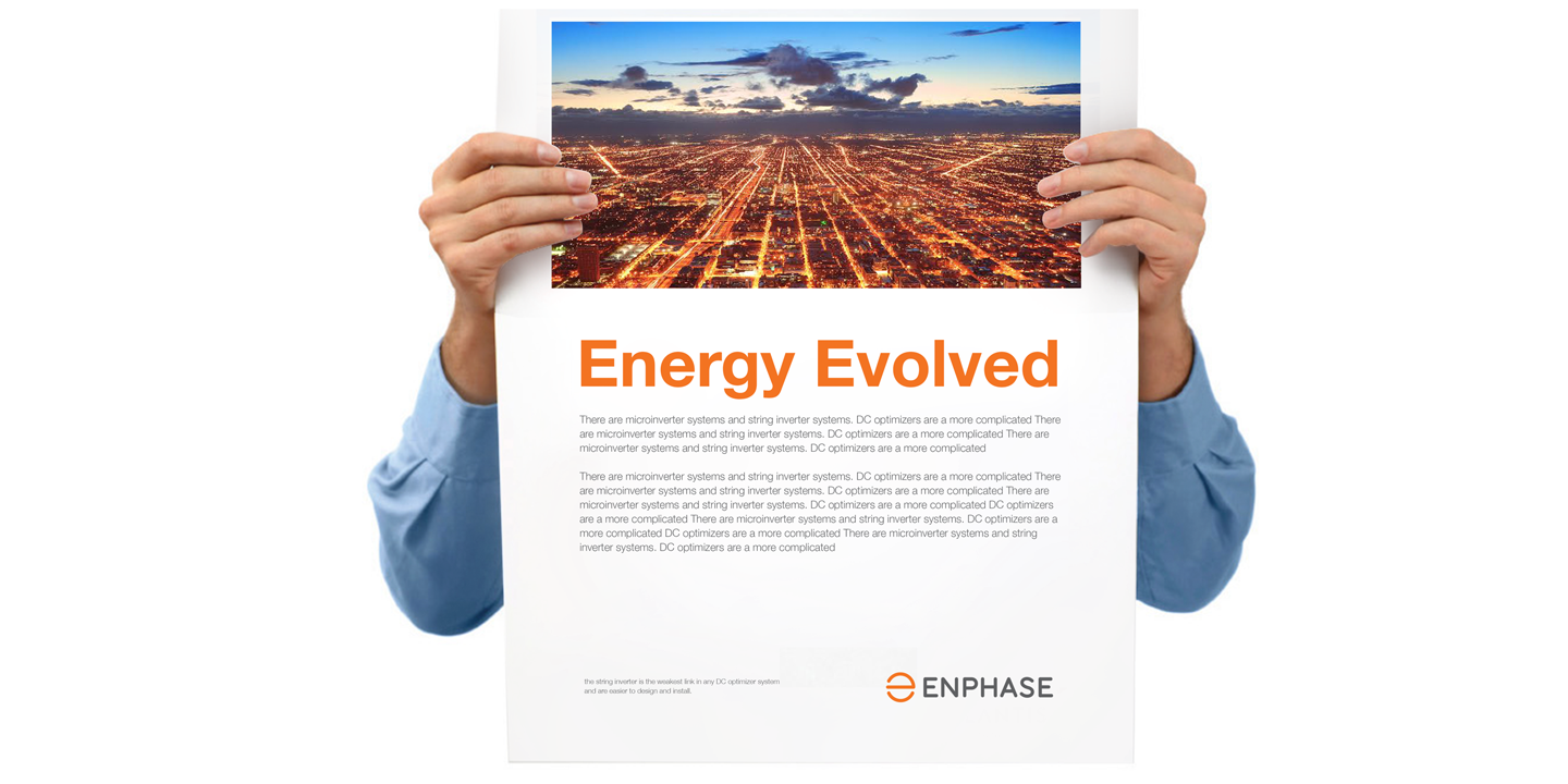
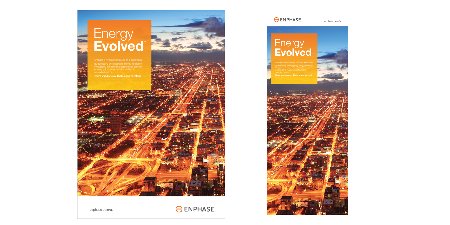
The brand relaunch was united under a theme of “Energy Evolved.” As solar installers were still the primary target audience, we felt this theme clearly connected Enphase and it’s technology with the future of energy.
Creative Direction: Andrew Loesel // Design: Andrew Loesel, Maya Brugos, Terrence Tymon // Writers: Andrew Loesel, Deborah Knuckey
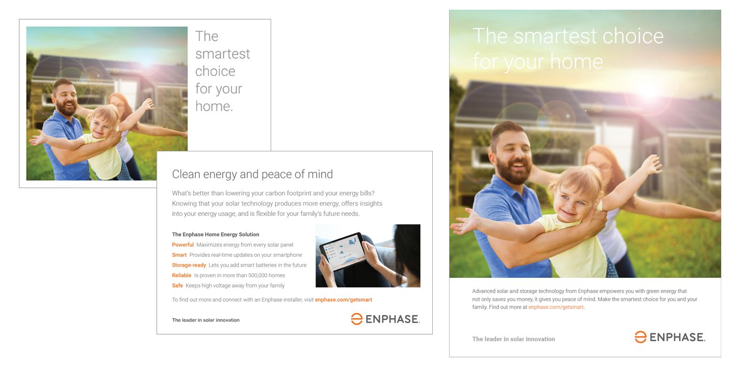
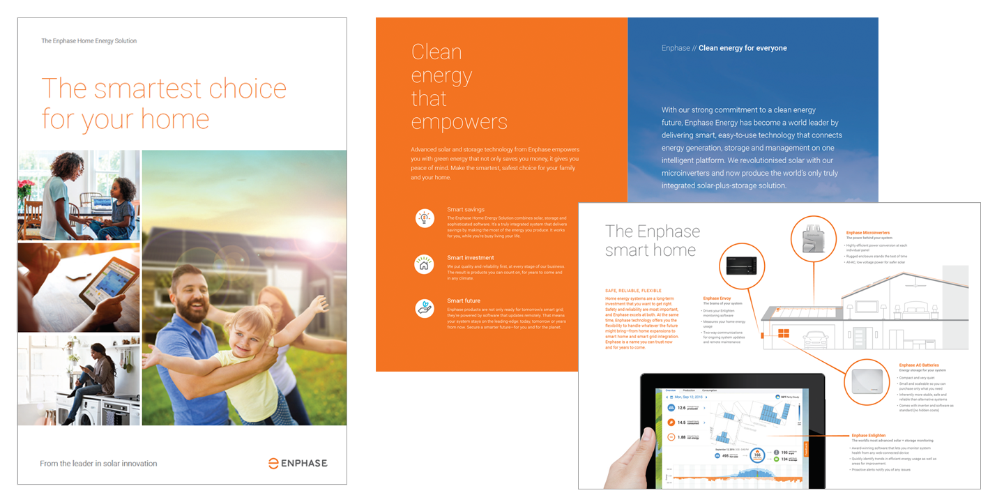
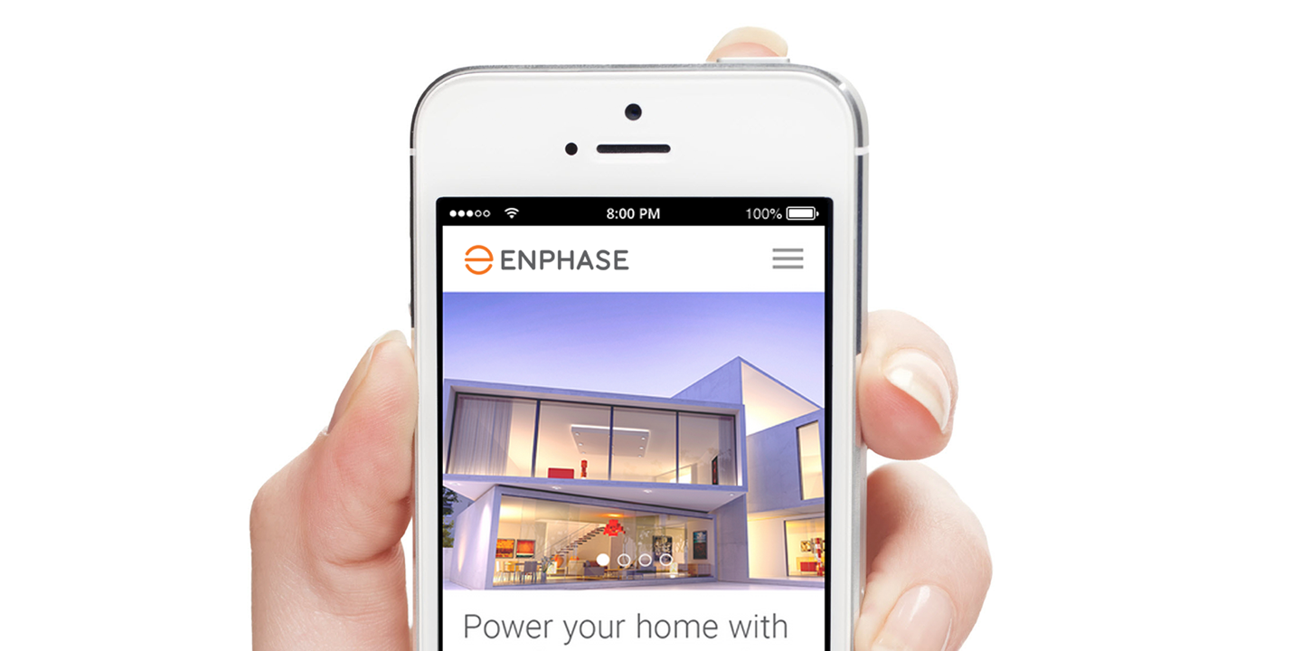
One key finding during our research on the rebrand was the fact that homeowners were a very important audience that the company had not been speaking to. More than 70% of web traffic to our site was coming from homeowners and installers were asking us for help. Consequently, we launched a first-ever consumer campaign.
Creative Direction: Andrew Loesel // Design: Andrew Loesel, Maya Brugos, Terrence Tymon // Writers: Caitlyn Browne, Matt Allan, Andrew Loesel,
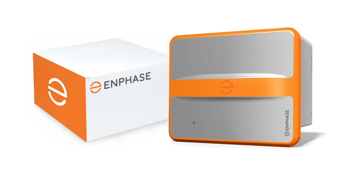
Packaging and product branding
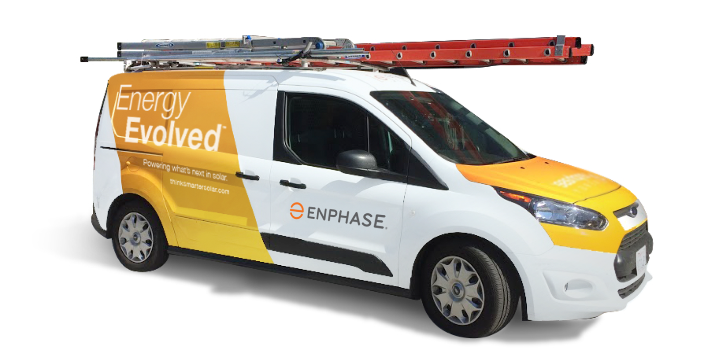
Truck branding
A simple logo animation tells a story and repositions the company.